A sales dashboard where every number opens
Eight ways to slice the same revenue, from traffic source to opening message to lead magnet. Click any figure and you get the actual people behind it, by name, rather than a chart filtered to that slice.
And where a number cannot honestly be known, the cell is left blank.
Get StartedThe numbers you open the app for
Recurring revenue, what is still open, what actually landed in the bank and what closed, on one line. The comparison against the previous period is on by default, because a number without a direction is trivia.

Underneath, the same period plotted by pipeline stage, so a spike in new leads that never becomes a booked call is visible as a gap between two lines rather than something you find out about at the end of the month.
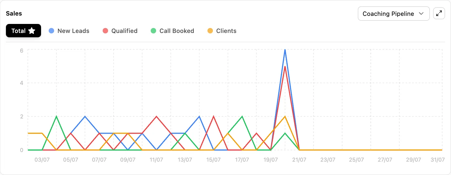
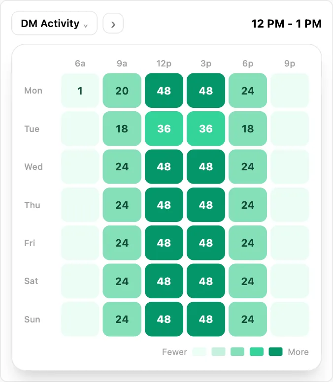
And because conversations are the input to all of it, when your audience actually messages you is its own view. Staffing a Tuesday evening because that is when the messages arrive beats staffing nine to five because that is what an office does.
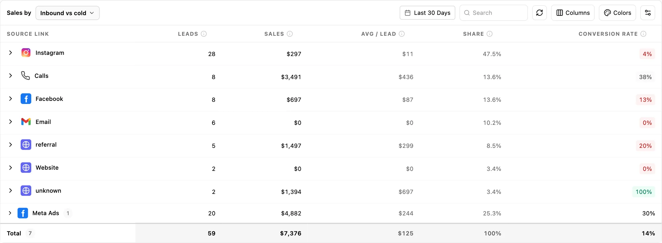
Sales by whatever the question is
Most dashboards answer how much. The useful question is which, and it changes depending on who is asking. A founder wants revenue by channel. A sales manager wants it by person. An agency owner wants it by client, this month, without building anything.
So the same revenue is re-cut seven ways, and switching between them takes a click rather than a request to whoever owns the spreadsheet.
| Break it down by | What it answers |
|---|---|
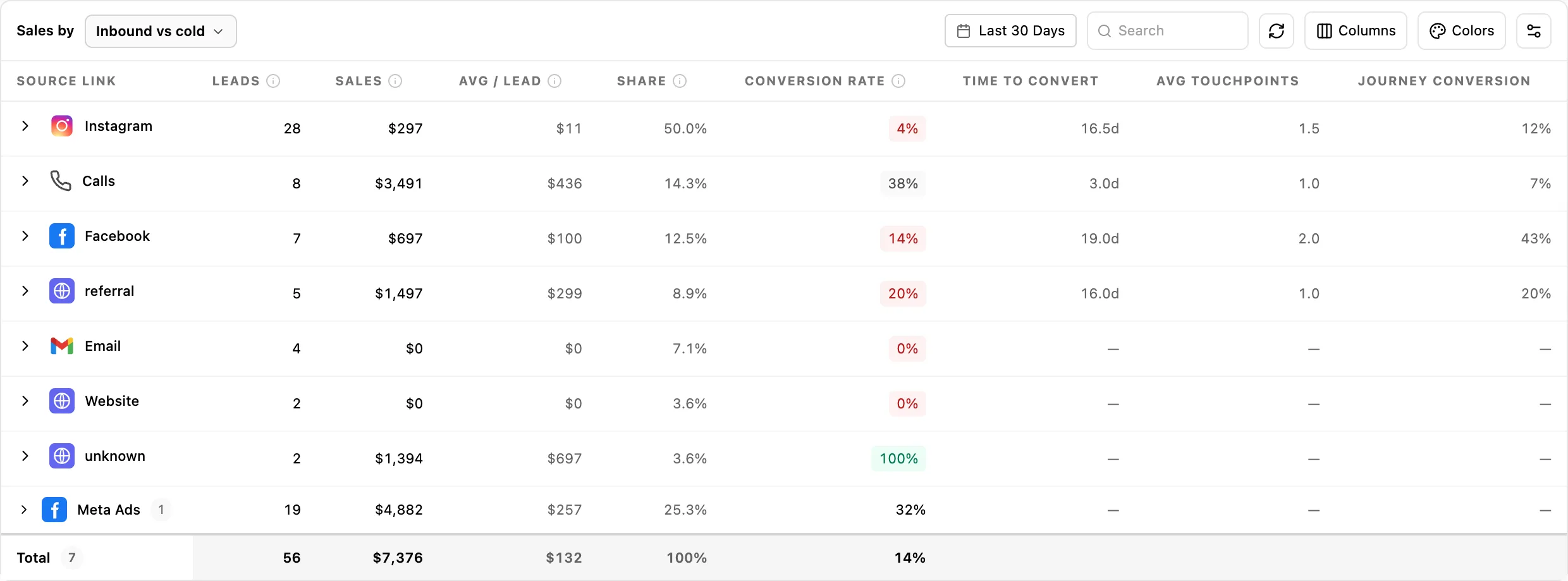
| Inbound vs cold | Did they come to you or did you go to them. The only view that carries the full multi-touch path data, because it is the only one where that data is genuinely real. |
| Traffic source | Which channel the money came from. The one everybody asks for, and the one most tools answer with sessions rather than revenue. |
| Source category | The same thing grouped up, for when you have forty sources and need to know whether paid or organic is carrying the quarter. |
| Employee | By person, with setter, closer, support and client as roles underneath. How the credit is split is explained below, because it is not what most people assume. |
| Opener | Revenue by opening message. Not reply rate, revenue. The opener that starts the most conversations and the opener that produces the most money are frequently not the same line, and almost nothing else will show you that. |
| Lead magnet | Which resource actually converts, measured as converters over consumers rather than downloads. A guide with four hundred downloads and two customers is a cost, and this is the view that says so. |
| Stories | Its own metric set entirely: reach, average completion, drop-off and link taps, because story performance does not fit the sales columns and pretending it does produces nonsense. |
| Pipeline | Revenue per pipeline, which for an agency running one pipeline per client is revenue per client without configuring anything. |
Every one of those carries the same core columns: leads, sales, average per lead, share of total, conversion rate and won. Alongside them, monthly and annual recurring revenue, over whatever date range you pick.
Traffic source being one of those dimensions is what makes a referral arrangement answerable rather than a matter of opinion. Six months after you agreed one, the question is whether it produced any revenue, and here it is a row rather than a conversation. Setting those arrangements up in the first place is the partnership finder.
The columns change with the dimension, deliberately
Three attribution columns exist on top of the core set: time to convert, average touchpoints before conversion, and journey conversion rate. They only appear on the views where that data is genuinely real, which is the inbound-versus-cold view, traffic source, source category and opener.
They are absent from the employee view because there is no real per-person touch data behind them, and from the pipeline view for the same reason. Stories has its own set entirely, because reach and completion do not belong in a table of sales columns.
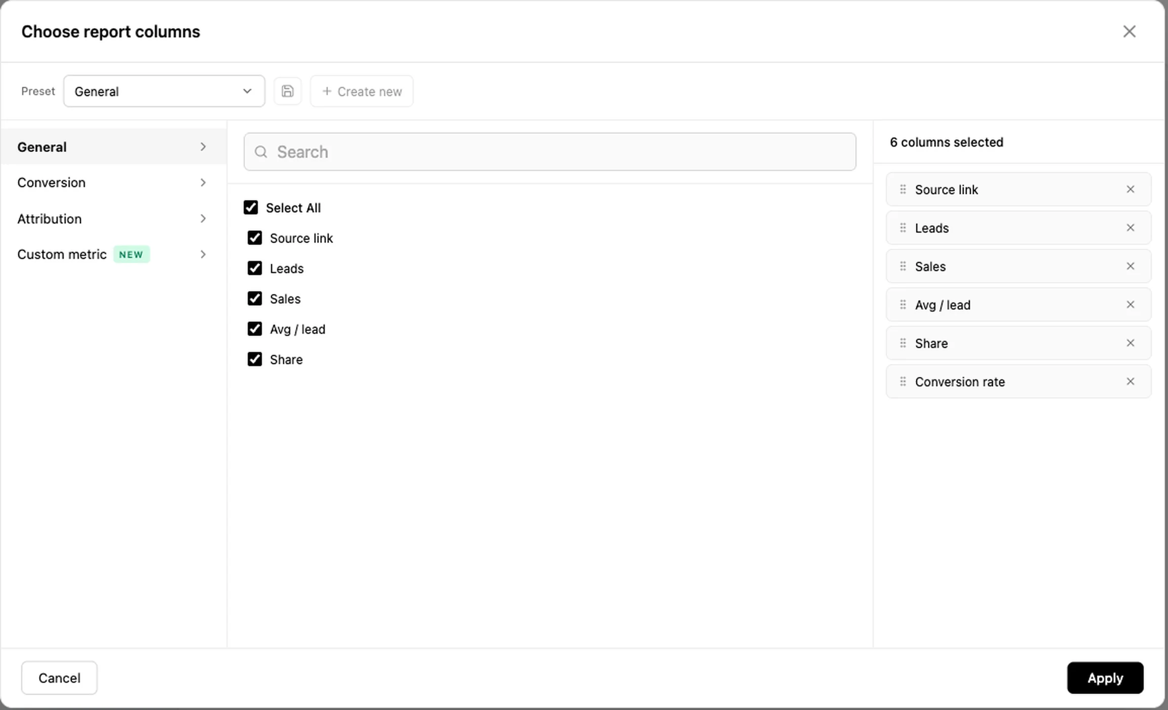
Columns outside a dimension set are hidden from the picker as well as the table, so a saved preference cannot resurface one on a view where it would be meaningless.
Who gets the credit, and why it is only ever one person
A deal usually has a setter who booked it and a closer who took the money, and both are recorded. The obvious thing to do is credit both, and it is wrong, because then your revenue by person adds up to roughly twice your revenue.
So the rule is single attribution: a won deal is credited to its closer, and an open deal is credited to its setter. Nothing is counted twice, the column totals reconcile against your actual revenue, and the person currently carrying the deal is the person it shows against.
That is worth understanding before you use it for commission, because it means the setter view is a picture of what is in flight rather than a claim on closed revenue. Support and client are recorded as roles too, so the whole set of people touching a deal is on the record even though only one carries the number.
The multi-touch path columns are separate from this and answer a different question: not who gets the credit, but how many touches and how many days it took to get there.
The funnel, end to end, with the leak visible
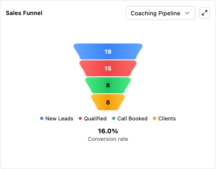
Six stages, each measured, with the conversion rate between them. Most businesses can see the first two and the last one and have to guess at the middle, which is where the loss almost always is.
- 1Views
- 2Clicks
- 3Form submissions
- 4Opportunities
- 5Appointments booked
- 6Closed won
Views and clicks come from your tracked links and bio pages and are held cumulatively, so you can see the curve rather than a single number. Submissions come from forms, appointments from the calendar, and closed from the pipeline. Because all four of those are the same product rather than four integrations, the stages actually join up instead of being four dashboards you eyeball together.
The useful reading is rarely the total. It is the one transition where the percentage is half what the others are, and it is usually somewhere unglamorous, like the gap between a form submission and an appointment actually being booked.
Two of those stages are worth following into their own reporting when the funnel points at them. If the leak is between views and clicks, the behaviour behind it is in heatmaps and session recordings, where you can watch the visits that did not convert rather than infer them. If it is between clicks and submissions, it is nearly always the form asking for something it did not need, and the half-finished fills are captured there too. And the transition this page calls out as the usual culprit, submissions to appointments booked, is the booking flow, which has its own stage-by-stage breakdown of where people drop out of booking specifically.
Click the number, get the people
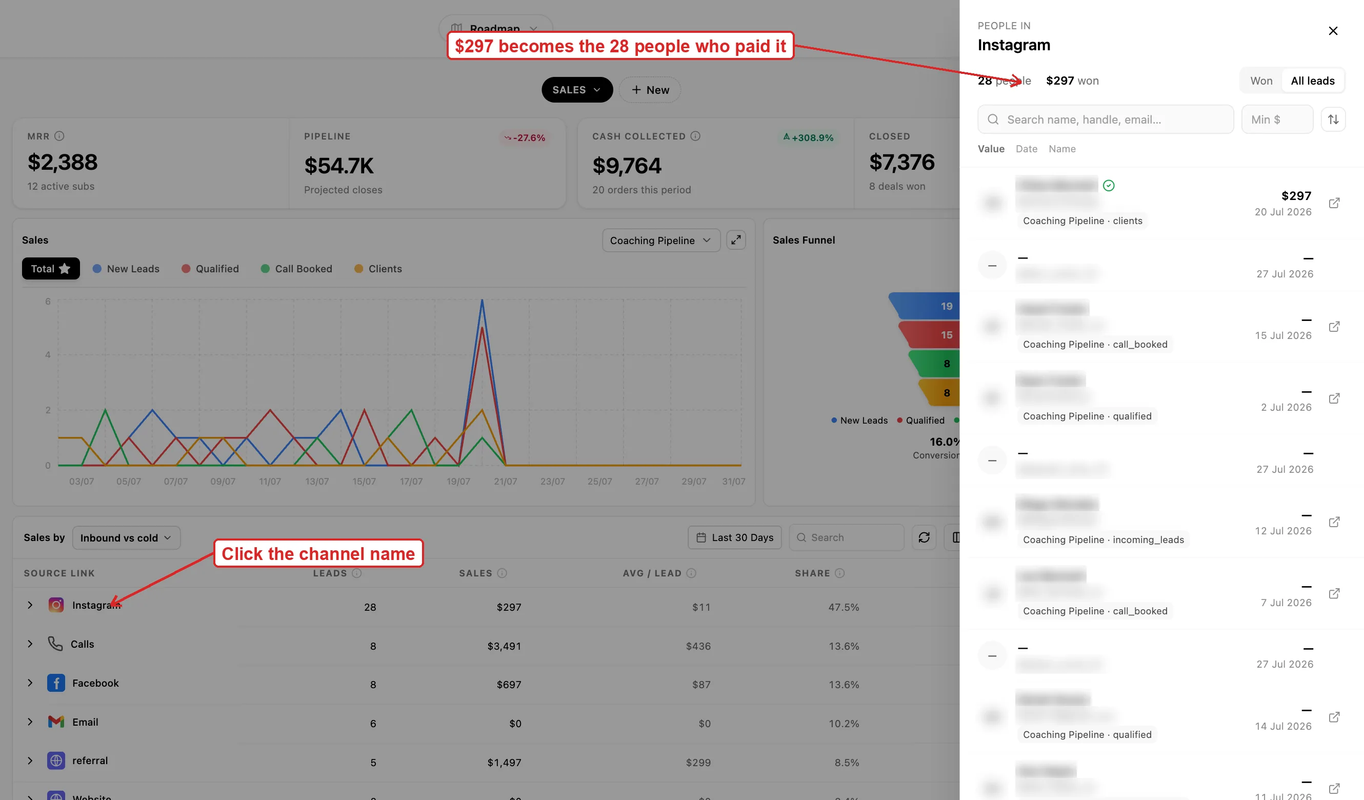
This is the part that changes what a dashboard is for. A row saying Instagram produced eleven thousand this month opens into the eleven customers who paid it, by name. Not a chart filtered to that slice. The actual people.
Which means the report is a working list. See that one setter has a poor conversion rate, open the bucket, and you are looking at the specific conversations that did not convert rather than a number to raise in a meeting. See that a source produced four customers, open it, and you can go and ask all four what nearly stopped them buying.
Most reporting tools cannot do this because they were handed a summary. This one reads the same records the rest of the product writes, so the people were never aggregated away in the first place.
What you can actually measure
- Revenue, recurring revenue, won and closed, by seven different cuts
- Single attribution: a won deal credits the closer, an open deal credits the setter
- Any bucket opened to the named people inside it
- Time to convert, average touchpoints and journey conversion rate per channel
- A six-stage funnel from views to closed won, with the rate between each
- Revenue by opening message and by lead magnet, not just by channel
- Audience retention, average watch time, profile views and website clicks per post
- Your own columns, built with a formula, added to the table
- Per-employee targets for conversations, meetings, calls booked and closed
- Daily and monthly targets, with actuals against them
- Response SLAs per channel, split into first and ongoing replies
- SLA timers that only run during your business hours
- Opener performance, CTA performance, and ghost rate per message
- Calls: volume, answer rate, average duration, calls per day
- Stories: reach, replies, shares, forward taps and exits
- Follower reach and non-follower reach as separate numbers
- Engagement per format: feed, reels and stories, not one averaged figure
- Likes, comments, shares and saves separately, plus follows gained from stories
- Daily averages for growth, reach, profile views, website clicks and story views
- Audience age brackets, gender and country, and when they are actually online
- Follower growth across Instagram, Facebook, TikTok and YouTube
- Top-performing content and reels
- Meta and TikTok ad spend against the same leads and revenue
- Filtered by client, by connected account and by date range throughout
Not included: a probability-weighted revenue forecast, and anything to do with SEO, backlinks or keyword rankings. Both are covered honestly further down rather than left for you to find out.
Columns you define, and the ones we refuse to offer
Every business runs on a ratio nobody else uses. A formula builder lets you make that a column in the table, saved and sitting beside the standard ones, instead of something one person works out in a spreadsheet each month and everybody else quietly disputes.
Why the list is short
The set of things you can build a column from is smaller than it could be, and that is a decision rather than an oversight. Only the bases carrying a genuinely real value for each individual row are offered.
Several were taken out before launch. They were available, they looked useful, and using them would have produced numbers that were really a lead count multiplied by a constant, dressed up to two decimal places. A metric like that is worse than no metric, because it gets quoted in a board meeting.
And where a value cannot be known for a particular row, the cell shows a dash. Not a zero, which reads as a measurement, and not an estimate. A dash, meaning we do not know.
What got deleted, specifically
It is easy to say a product does not fabricate numbers. Here is what that actually cost, in metrics that existed, looked convincing, and were taken out before launch:
- A pipeline-value column that was your sales figure multiplied by 1.8. It looked like a projection. It was a constant.
- Seven and thirty day trend indicators that were generated from a hash of the row rather than from any historical series. They moved. They meant nothing.
- Sales forecasting, removed from every view, because no real backend series existed behind it.
- Calls, closes and revenue columns on the stories view, which had no backend writer at all.
- The multi-touch path columns on the employee view, which were dummy data, so they are hidden there and kept only where the data is real.
Every one of those would have made the dashboard look richer in a demo. A prospect comparing screenshots would have scored us higher with them in. They came out because the first customer to check one by hand would have been right to stop trusting all of it.
This is the same call made in two other places in the product: the pipeline has no probability-weighted forecast because the data does not support one, and a partnership proposal leaves market size blank rather than inventing it. A dashboard that fills every cell is easy to build and impossible to trust.
Targets per person, per day
Four things get a target for each person: conversations, meetings, calls booked and deals closed. Each carries both a daily and a monthly number, with the actual figures beside them.
The daily target is the one that does the work. A monthly number is something a rep discovers they have missed on the twenty-eighth, when nothing can be done about it. A daily one is a decision about this afternoon. It also changes what a one-to-one is: a conversation about a number both people can see, rather than an argument about whether somebody is working hard enough.
How fast people reply, measured honestly
Response time has the clearest link to revenue of any metric in a business that sells through conversations, and it is the one most teams measure badly or not at all.
First reply and ongoing reply, separately
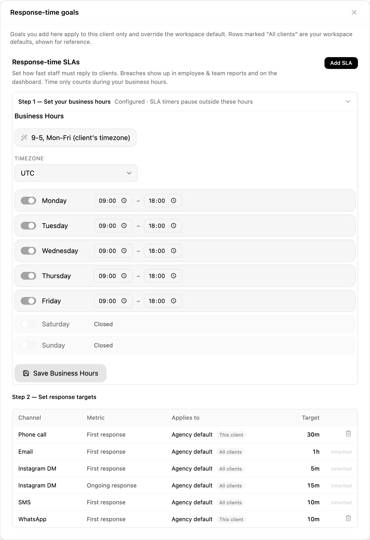
They are different promises and deserve different targets. Two minutes to the first message from a stranger is what wins the deal. Two minutes to every subsequent message in a conversation running for a week is not a standard anyone can hold, and setting it that way is how a team learns to ignore the whole measurement.
Per channel, and per person
An Instagram DM and an email are not the same expectation, so they get separate targets. And a target can apply to the whole agency, to a role, or to one individual, which matters when a new setter and a senior closer are otherwise being held to the same number for no good reason.
The timers stop outside business hours
This sounds like a small detail and it decides whether the measurement gets used at all. Without it, a message arriving at six on Friday evening is a sixty-hour breach by Monday morning, every weekend produces a wall of red, and within a fortnight nobody looks at the report. Set your hours and the clock only runs when someone was supposed to be there.
Down to the individual message
Openers, calls to action and the questions people ask are tracked as things in their own right, with performance attached to each. Which is how you find out that the opener everybody on the team uses is the third best one you have.
Openers and CTAs, ranked
Every opening message you use with how it performed, and every call to action by type. Averaged across all of them so you have a baseline, because a reply rate means nothing until you know what normal looks like in your own account.
Ghost rate: what ended the conversation
The share of conversations that went silent after a given message, tracked against the message itself. Nearly everybody measures reply rate, which tells you what works. Almost nobody measures the other end, which is what makes people stop replying.
They are not the same list. A message can pull good replies from the people it suits and quietly kill every conversation with the people it does not, and on a reply-rate report it looks fine. The ghost rate is usually the more actionable of the two, because deleting a message is easier than inventing a better one.
The questions people ask you
The questions coming into your inbox, collected and counted. Read it twice a year and it will rewrite your website: the thing forty people asked last month is the thing your pricing page does not answer, and every one of those was a conversation somebody had to have manually.
Calls
Total volume, answer rate, average duration and calls per day. Answer rate is the one that gets ignored and the one that costs money: a fifty percent answer rate means half your booked calls never happened, and no amount of improving the pitch fixes that.
Average duration is worth reading against outcome rather than on its own. Calls that end quickly are usually either a very fast no or a very fast yes, and knowing which one your short calls are is the difference between a qualification problem and a good week.
The messages themselves live in the unified inbox.
The social side, underneath rather than instead
All of it is here, and it sits below the revenue reporting rather than in place of it, which is the correct order: reach is an input and revenue is the outcome, and a tool that only shows the first one lets you feel productive for a quarter.
Growth across four platforms
Follower growth for Instagram, Facebook, TikTok and YouTube, per account and per channel, so an agency running twenty accounts sees them together rather than logging into twenty apps.
Stories, frame by frame
Reach, replies, shares, forward taps, back taps and exits, with a full navigation breakdown. Exits are the honest metric: the frame people leave on is the frame that lost them, and it is usually not the one you would guess.
Stories also get their own view in the sales table, with reach, average completion, drop-off and link taps. Completion and drop-off together tell you where a sequence dies, and link taps tell you whether the ask at the end was worth the four frames of setup.
Who your audience actually is
Age distribution, gender split and country. Worth checking against who actually buys from you, because those two lists disagree more often than anyone expects, and it is usually the paid targeting that is wrong.
When they are online
Peak activity by hour for your own audience, not an industry chart. This is also what the scheduler uses to decide when to publish, so the two agree instead of contradicting each other.
Top-performing content and reels are here too, and the publishing side is the scheduler.
How long it took, and how many times you touched them
Three columns that most reporting does not have at all, sitting beside the revenue on the views where the data behind them is real.
Time to convert
Average days from first touch to money, per channel. The number that tells you whether a channel is underperforming or just slower, which are two completely different problems and get treated as one constantly. A channel with poor conversion at thirty days can be your best channel at ninety, and if you judge it monthly you will switch it off before it has finished working.
Average touchpoints before conversion
How many interactions it actually took, per channel, before somebody bought. This is the number that ends the argument about whether follow-up sequences are worth building. If your average is six touches and your sequence stops at three, you are paying to generate leads and then abandoning half of them at the point they were about to convert.
It also varies far more by channel than people expect, which is why one follow-up sequence applied to every source is usually wrong in both directions at once.
Journey conversion rate
The conversion rate across the whole path rather than at a single step, which is the honest version of the number everybody quotes. A single-step rate flatters whichever step you chose to measure.
Rebuilt on request, not silently
The attribution behind these figures is expensive to compute, so it is built into a ledger rather than recalculated on every page load. Changing the date range or the client filter re-reads what is already there and is instant. The refresh button is what triggers an actual rebuild. That distinction is deliberate: it means the dashboard stays fast, and it means you know when you are looking at a freshly computed number rather than assuming.
Content, down to how long they watched
Retention and watch time
Audience retention, average watch time and total video view time, not just plays. A reel with forty thousand views and three seconds of average watch time did not work, and on a views-only report it is your best post of the month.
What a post actually did for the account
Impressions, engagement rate, shares, comments, replies, and then the two that matter commercially: profile views and website clicks. A post that drives profile views is doing recruitment; a post that drives website clicks is doing sales. Knowing which one you just made is the difference between a content plan and a hobby.
Top performers, and everything else
A ranked list of your best content and a full list of recent posts with their metrics, plus growth rate per account. Both matter: the top ten tells you what to make more of, and the full list tells you what your median post looks like, which is the honest picture of the account.
Collaborations, split by direction
Crossover campaigns are reported as either a business promoting through a creator or a creator promoting a business, because they are different arrangements with different economics and averaging them together produces a number nobody can act on.
And because custom objects are part of the product, anything you have modelled yourself can be reported on here too rather than living in a table nobody looks at.
Account growth, taken apart
Follower count is the least useful number on a social account and the one every tool leads with. Here it is one figure among about thirty, and several of the others will tell you more about whether the account is working.
Reach split by whether they already follow you
Follower reach and non-follower reach as separate numbers. This is the single most useful split on the page and almost nobody looks at it, because most tools report one combined reach figure that hides the entire question.
An account whose reach is ninety percent existing followers is not growing, it is talking to itself, and it will feel busy right up until the day the numbers stop. An account with high non-follower reach is being pushed to new people, which is the only mechanism by which anything gets bigger. Two accounts with identical total reach can be in completely opposite health, and this is the number that tells you which one you have.
Engagement, per format rather than averaged
Overall engagement rate, and then reel engagement and story engagement separately, plus a combined figure. Averaging them together is how a strong reel programme hides a dead feed, or a good feed hides the fact that nobody watches your stories past the first frame. Content is also broken down by type, so images, reels, carousels and stories each carry their own numbers rather than being one pile.
Averages per day, which is what a trend actually is
Average daily growth, daily reach, daily profile views, daily website clicks, daily content views and daily story views, plus growth against last month. A monthly total conflates how much you posted with how well it did. A daily average survives a month where you posted eleven times and a month where you posted four, which is the difference between measuring the account and measuring your own effort.
Interaction, not just consumption
Likes, comments, shares and saves as separate figures rather than one engagement number. Saves and shares are the two worth watching, because a save is somebody deciding your content is useful later and a share is somebody spending their own reputation on it. Both predict growth far better than a like does, and both get buried the moment you average everything into a single percentage.
Stories as their own account
Story views, story reach, replies, shares, follows gained from stories, and total story interactions, all separately. Follows from stories is the one people are surprised by: for a lot of accounts stories are where the actual conversion to a follow happens, while the feed post is just what got them there.
Who they are and when they are there
Age, in the brackets that matter
Eighteen to twenty-four, twenty-five to thirty-four, thirty-five to forty-four, forty-five to fifty-four, and fifty-five and over. Worth putting next to your actual customer list rather than reading alone, because the gap between who follows you and who pays you is where most bad targeting decisions come from.
Gender and country
The gender split and where in the world they are. The country breakdown is the one that quietly changes decisions: a third of your audience being somewhere you do not sell explains a reach figure that never converts, and it is invisible until you look.
Peak activity, hour by hour
When your audience is actually on, for your account, rather than a published chart of when audiences in general are on. Those charts were obsolete the moment every platform started personalising delivery, and if you sell to nurses or bartenders they were never right in the first place.
And it feeds the scheduler
The same activity data is what the publishing side uses to decide when to post, so the recommendation and the report agree. Two tools disagreeing about when your audience is awake is a small thing that erodes trust in both.
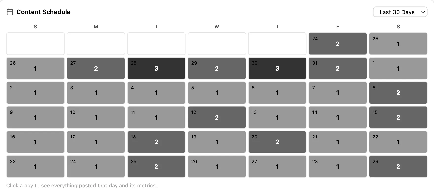
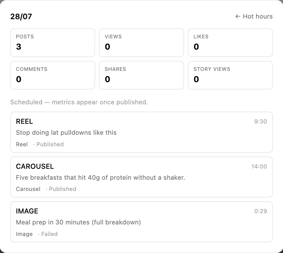

Every number, narrowed the same three ways
By date, with fourteen, thirty and ninety day presets and a custom range. By client, which recalculates the entire dashboard rather than one widget. And by connected account, individually or in any combination, with a select-all when you want the lot.
The combination is what makes the monthly report survivable for an agency. Pick a client, pick last thirty days, and every section on the page is now about them: their revenue by source, their funnel, their content, their audience, their response times. Nothing to assemble, nothing to caveat, and no risk of a figure from another client appearing in a deck it should never be in.
The date range is also the honest control on everything above it. Time to convert, average touchpoints and conversion rate all move with the window you choose, and a thirty-day window on a product with a sixty-day sales cycle will always make you look worse than you are. Set the window to something longer than your cycle before you draw a conclusion from it.
Paid sits in the same table as everything else
Meta and TikTok spend reports against the same leads, pipeline and revenue as your organic sources, so cost per lead and return on ad spend sit beside everything else rather than in a separate tool that stops at the click.
That comparison is the useful one and almost nobody has it. Knowing a channel costs forty pounds a lead is half a sentence until you can see what a lead from your organic Instagram costs, and which of the two turns into money.
The paid detail underneath is deeper than the rollup suggests. For Meta we keep 58 separate fields per campaign, ad set and ad, every day since March 2023: six distinct click types each with its own cost-per, the full video funnel from 25 through 100 percent completion with average watch time, Meta's quality, engagement and conversion rankings, and four outcome types priced separately rather than blended into a single cost per acquisition. Every creative is mirrored into our own storage as it arrives, so an ad deleted in Meta keeps both its file and its history here.
The campaign, ad set and creative detail, plus the copy bank, is on the Meta and TikTok ads page.
What it will not tell you
There is no probability-weighted revenue forecast. Nothing assigns each open deal a percentage chance of closing and sums it into a number for next month. You get conversion rates, average time to close and the real figures, which is enough to work out what the board is worth. If a weighted forecast is what somebody wants every Monday, Pipedrive and HubSpot both do it properly and we do not.
There is nothing about SEO here either: no keyword rankings, no backlinks, no organic traffic estimates. That is a different category of tool and Semrush and Ahrefs own it.
And the attribution is honest rather than complete. Where a value cannot be known for a row it stays blank, which means some cells are empty in a way a less careful dashboard would have filled in. That is the trade, and it is deliberate.
Who this is built for
Sales managers running setters and closers
Both roles credited separately, daily targets against actuals, response SLAs measured during hours people are actually working, and every number opening onto the conversations behind it. This is the case the reporting was shaped around, and if you run a team of two roles most of this page is about you.
Agencies writing monthly reports
Filter everything to one client and the whole dashboard recalculates, which turns an afternoon of screenshots into ten minutes. And reporting revenue rather than reach ends the renewal conversation in whichever direction it deserves to end, which is better for both sides than a deck full of impressions nobody can convert into a decision.
More in the agency use case and agency pricing.
Founders who want one number and then the detail
Revenue by channel answers the question you asked. The drill-through answers the three you were about to ask next. Most dashboards are built for the first and force a request to somebody for the second, and the gap between those is where a week goes.
Small and medium businesses with nobody doing reporting
The honest version: you will use about a fifth of this, and that is fine. Revenue by source and the response SLA are the two worth setting up in your first week. Everything else is there when the business is big enough to have the question, and ignoring it until then costs you nothing.
See how small businesses use Inflowave and what it costs for a small team.
Getting something out of it in the first week
1. Look at revenue by source, then by closer
Two clicks, and the second one is usually the surprise. The channel producing the most leads and the channel producing the most money are frequently different, and the same is true of your busiest and your most profitable person.
2. Open the worst bucket, not the best one
Everyone drills into the winner. The loser is where the information is: open it and read the actual conversations that did not convert. Twenty minutes of that beats any amount of staring at a chart.
3. Set one SLA, and your business hours with it
First response only, on your busiest channel, at a number you can actually hit. Set the business hours at the same time or the report will be nonsense and you will stop trusting it within a fortnight.
4. Give one person a daily target
Not the whole team, and not four metrics. One person, one number, for a month. It is the fastest way to find out whether your targets are realistic before you attach anyone pay to them.
5. Check the ghost rate before writing new openers
Deleting the message that kills conversations is easier and more reliable than inventing a better one, and most teams have at least one in regular use.
Common questions
What can revenue actually be broken down by?
Traffic source, source category, pipeline, client, setter, closer and employee. The two worth calling out are setter and closer, because they are held separately rather than collapsed into one deal owner, which is how most reporting quietly erases the person who booked the call. Any of them combines with a date range and filters down to one client or one connected account.
Can I see who is behind a number?
Yes, and this is the part people do not expect. Click any bucket in the sales-by table and you get the individual people it is made of, by name, rather than a chart filtered to that slice. A row saying Instagram produced eleven thousand this month opens into the eleven customers who paid it. The report becomes a working list instead of something you read and then rebuild by hand in the CRM.
Can I build my own metrics?
Yes, with a formula builder that adds your own columns to the table. The list of things you can build from is short, deliberately: only the bases that carry a genuinely real value for each row are offered. Several were removed for exactly that reason, because using them would have produced a figure that looked precise but was a lead count multiplied by a constant. Where a value cannot honestly be known for a row, the cell shows a dash.
Why are some cells showing a dash instead of a number?
Because the number is not knowable for that row, and we would rather show nothing than something invented. It is the same decision as the missing revenue forecast on the pipeline and the blank fields in a partnership proposal. A dashboard that fills every cell is easy to build and impossible to trust, and the first time somebody checks one of those numbers by hand you lose the whole report.
What KPI targets can I set?
Conversations, meetings, calls booked and deals closed, each with a daily and a monthly target, set per employee, with the actual figures shown against them. The daily number is the one that changes behaviour, because a monthly target is something people find out they have missed on the twenty-eighth. It also makes a one-to-one a conversation about a number rather than about a feeling.
How do the response-time SLAs work?
You set how quickly someone has to reply, separately for the first response and for replies within an ongoing conversation, and separately per channel, because a DM and an email are not the same promise. Targets apply to the whole agency, to a role, or to one person. Critically, the timers only run during your business hours, which is what makes the measurement usable rather than every Friday-evening message being a Monday-morning breach.
What is the ghost rate?
The share of conversations that went silent after a particular message, tracked against the message itself. Most teams track reply rate, which tells you what worked. Ghost rate tells you what ended things, and those are not the same list. The message that gets the most replies and the message that kills the most conversations can both be in your top five, and only one report shows you the second one.
Does it still do Instagram and social analytics?
Yes. Follower growth across Instagram, Facebook, TikTok and YouTube, top-performing content and reels, story-level breakdowns including exits and forward taps, audience age, gender and country, and when your audience is actually active. It sits underneath the sales reporting rather than instead of it, which is the right order: reach is an input, revenue is the outcome.
Does it forecast revenue?
No, and we say the same on the pipeline page. There is no model assigning each open deal a percentage chance of closing and adding it up. You get conversion rates, average time to close and the actual numbers, which is enough to work out what the board is worth without implying more confidence than the data supports. If a weighted forecast is what you need, Pipedrive and HubSpot both do it properly. What the pipeline does report.
Can I filter it to one client for a report?
Yes, by client, by connected account and by date range, and the filter applies across the dashboard rather than to one widget. For an agency that is the difference between a monthly report taking ten minutes and taking an afternoon of screenshots. What we build for agencies.
Is ad spend in here too?
Yes. Meta and TikTok spend reports against the same leads, pipeline and revenue, so cost per lead and return on ad spend sit beside the organic sources rather than in a separate tool that cannot see what happened after the click. The Meta and TikTok reporting.
What is the difference between follower and non-follower reach?
Follower reach is people who already follow you seeing your content. Non-follower reach is everybody else, which is the only way an account grows. Most tools report one combined number, which hides the question entirely. An account whose reach is almost all existing followers is talking to itself and will feel busy right up until the numbers stop; an account with strong non-follower reach is being shown to new people. Two accounts with identical total reach can be in opposite health.
Why do the attribution numbers change when I change the date range?
Because time to convert, average touchpoints and conversion rate are all properties of a window, not fixed facts. A thirty-day window on a business with a sixty-day sales cycle will always understate everything, since half the journeys have not finished yet. Set the window longer than your sales cycle before drawing a conclusion, and be suspicious of any tool that gives you the same figure regardless of the period you ask about.
How current are the numbers?
The attribution work is expensive to compute, so it is built into a ledger rather than recalculated on every page load. Changing the date range or the client filter re-reads what is already built and is immediate. The refresh button is what triggers a real rebuild. That split is deliberate: the dashboard stays fast, and you always know whether you are looking at a freshly computed figure or a stored one.
Can I report on my own custom objects?
Yes. Anything you have modelled as a custom object can be reported on here rather than living in a table nobody opens. For businesses whose actual unit is a property, a vehicle, a course or a matter, that is the difference between reporting on your business and reporting on a generic approximation of it. About custom objects.
Where does the data come from?
From the product itself rather than from an import. The conversations, deals, bookings, calls, payments and tracked links already live here, which is why revenue can be attributed to a source at all. A reporting tool bolted onto a CRM can only report what the CRM was told. This reports what actually happened.
Stop reporting reach
Revenue by source, by pipeline, by client, and by the two people who actually earned it, with every number opening onto the customers behind it.
Get Started